Compressed Dynamic Range
There is an in-depth Photoshop tutorial in this article, so make sure to read the whole thing!
There has been a good deal of activity and interest lately in the area of “high dynamic range” or HDR imagery. Many of these “HDR” images are characterized in part by a surreal or otherworldly feeling accompanied by an ethereal glow surrounding the subject. I think the term “HDR” was ill-conceived in this context. There is such a thing as a high dynamic range image, but you wouldn’t be able to view it because it contains more tonal data than you can perceive or that a computer monitor could display. A true HDR image would be processed into viewable images by compressing its range; essentially by running it through Photoshop’s “levels” or “curves” (but not in Photoshop, because Photoshop probably couldn’t open it).
The HDR images you see on Flickr and PhotoSIG are actually compressed dynamic range because they portray scenes that had too much tonal range to be captured in a single frame; the range of tones from highlight to shadow are compressed into the range of a normal image. This is usually achieved by making two or more frames at different exposure settings and combining them using Photoshop or one of a number of standalone and plug-in softwares for that purpose (such as Photomatix, PanoTools, etc.)
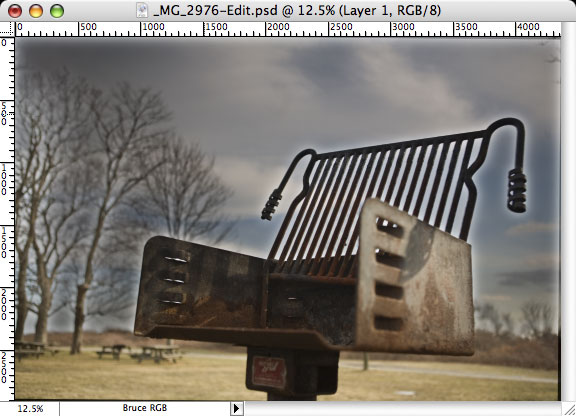
It’s easier to understand (for me, at least) using pictures, so here is an example. The two photographs below were taken of the same scene, a scene with too much range for my camera to see full highlight and shadow detail at the same time. One of the photos is exposed to capture the highlight data completely and the other is exposed to capture the shadow data completely.
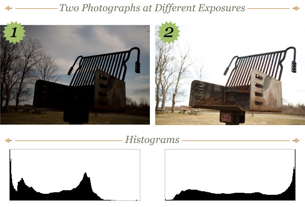
Below the photos you can see their histograms (I just snagged these from Photoshop’s histogram palette). Notice how photo #1’s histogram is biased toward shadow data and photo #2’s is biased toward highlight data. You can see from the pictures themselves that #1 has a much cooler looking sky, while #2 has the detail you would probably want in the subject (in this case, a humble charcoal grill).
If you had a copy of Photomatix, you could just provide it with these two photos and off it would go. I, myself, don’t have a copy of Photomatix, so I’m going to show you how to combine the best parts of these two images using only Photoshop. I’m going to assume you have a functional understanding of Photoshop; if you don’t understand any of the terminology used in my instructions, check out the Photoshop online help or shoot me an e-mail.
Now, before I dive in, I should mention something about HDR. Using HDR software (or techniques) with the idea that more detail in more areas is always better will only land you with very flat, continuous, boring photos. Always keep the overall aesthetic of your work in mind as you apply these techniques and don’t come under the impression that HDR is a silver bullet for an imaginary digital camera sensor limitation. Okay, that’s enough with the lecture!
I’m going to combine the two photos above into a single CDR (compressed dynamic range) photo. The basic idea is to let the properly exposed part of the top photo cover the same part of the photo beneath it (where it’s not properly exposed), and then also hide (or mask) the improperly exposed part of the top photo so the properly exposed part of the photo beneath it shows through. It might sound complicated, but it’s really not too hard.
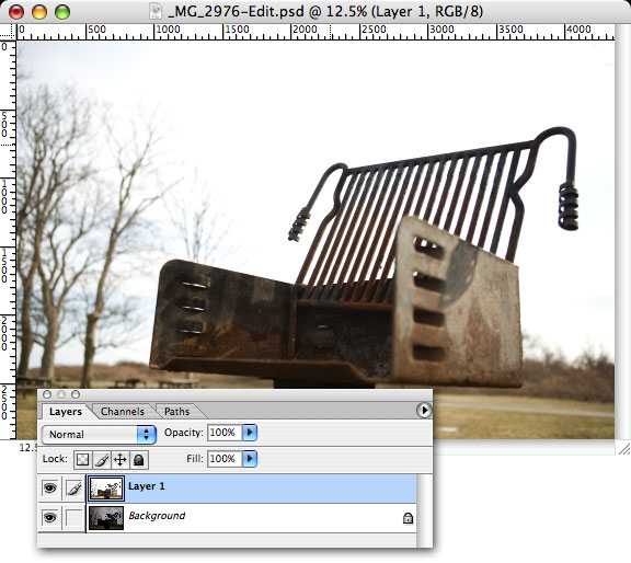
Because I took both photos without a tripod, I will have to re-align them with one another. Ideally it’s best to use a tripod to get two nearly identical frames at each exposure, but I didn’t have mine with me so I did the best I could. Open both photos in Photoshop and drag one into the other so that both images are in the same document. You will see from the screenshot below that I have placed the photo with the subject properly exposed on top of the photo with the background properly exposed. It doesn’t matter which photo is on top, but you may have to alter the steps if you do it differently.
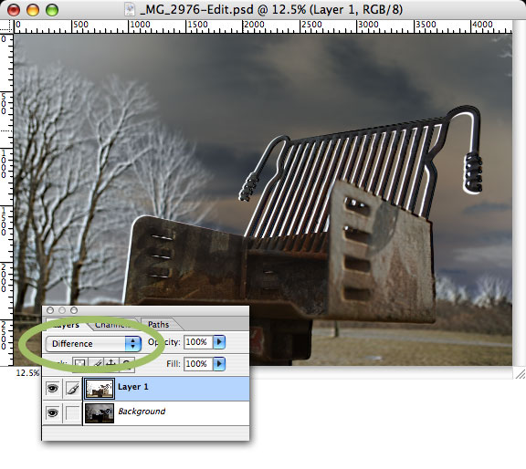
Now that you have the photos layered atop one another, it’s time to align the images. What I typically do is put the top layer in “difference” blending mode, which allows me to see exactly how the shapes overlap. Here is what it should look like and where you can find the “difference” option in the layers palette.
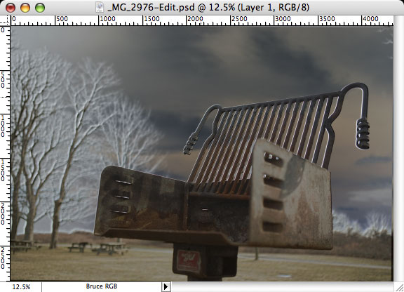
What you want to do is eliminate those white spaces as much as possible. Use basic transformation commands and techniques to alter the top layer (“Layer 1”) until the white spaces are as small as you can get them. I’m not going to go into the specifics of transformation; all that stuff is covered in-depth in the Photoshop online help ((See Transforming and Retouching –› Transforming objects –› Using the Free Transform command.)). Hopefully after you’ve worked on it for a bit, it will look more like this:
There is still a bit of white left in my example, but don’t sweat it, it’s not that picky an effect. Now you can turn off “difference” mode (switch it back to “normal.”) The next step is to create a mask that will hide the terribly overexposed sky in the top photo so that the awesome sky beneath it will show through. For this, I will use a little trick in the channels palette.
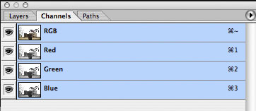
Take a peek in the channels palette. What you want to do is click on each of the Red, Green, and Blue channels and find the one that has the most contrast between the subject and the background. It won’t be perfect, but for this type of effect it’s very handy that your sky is overexposed. For me, the blue channel had the most contrast. Hold down the Command key (Windows users, that means the Control key) and click on the channel of your choice (blue, in my case). It should create a selection in your document.
Now, with that selection intact, click on the RGB channel to bring your photo back. Here is another fun masking trick. Press “Q” on the keyboard to turn on Quick Mask Mode. What you see ought to look something like this ((See Selecting –› Using Quick Mask mode to make selections.)).
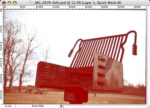
Quick Mask Mode is based on a tried-and-true masking technique that was used in old-school publishing. The red color is a throwback (or shout-out for you urban kids) to a product called Rubylith, which was used to mask elements in a page layout or design before computers made that process drop-dead simple ((Some smaller newspapers and design shops still build layouts by hand, but I think it’s sadistic.)). In Photoshop terms, the red areas will not be included in the selection when Quick Mask Mode is turned off.
You can always invert selections, so it’s not really important to us that the selection contain the subject or the background. What is important to us, however, is that the foreground is as well-masked as possible. Right now, the darkest areas of the foreground are fully masked (as you can tell by the darker red), whereas the right edge of the grill is only partially masked because its blue channel was brighter there. What are we to do?
Enter the levels palette. When you are in Quick Mask Mode, levels will affect the mask, not the image. A stroke of genius from Adobe, if I do say so myself.
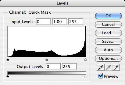
This is what the levels looked like for me. What you’re going to want to do is drag the shadow slider (the black triangle at the left edge of the histogram) over to the right until your subject is as dark red as it can be without starting to turn the background red as well. Histograms are very interesting things; what you will probably find is that the shadow arrow winds up parked right at the edge of a pretty obvious slope, a slope representing where your foreground subject’s data drops off into the abyss of your overexposed sky.
Pay attention to how the quick mask reacts to where you’ve dragged the triangle and get it to where you feel it’s optimally dark across your subject and hopefully not too red at all in the background. When you think it looks good, press “Q” again to convert the quick mask back into a selection (you can toggle back and forth between selections and quick masks at any time).
As I explained earlier, the portions of the image that appeared red in Quick Mask Mode were excluded from the selection, so this selection should contain the background only. Go up to the Layers menu, choose Add Layer Mask, and then choose Hide Selection. Your properly exposed background elements should now show through!
But it probably doesn’t look too hot, does it? The problem is usually that the images aren’t perfectly aligned, and even if they are, there are probably going to be little jaggies and artifacts due to the overlap of detailed elements. Don’t worry, there is a solution to this problem, and with it comes another fun layer mask trick.
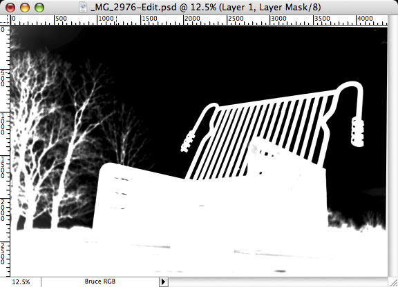
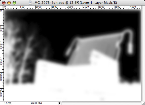
Hold the Option key (Windows users, hold Alt) and click on the layer mask’s thumbnail in the layers palette. The layer mask thumbnail is the one that looks like a silhouette next to the thumbnail of the actual image. The document itself should now look like a silhouette, like this:
Now we can use any Photoshop painting tools or filters on the mask itself. For this trick, we’ll use the Gaussian blur filter, found under Filters in the Blur menu. How much you blur the mask depends on the resolution of your image. Mine is around 13 megapixels, so I had to apply a Gaussian blur radius of around 50-60 to make it stand out. It should look something like this:
To return to the image, click on its thumbnail in the layers palette. Hopefully you now have a pretty awesome-looking compressed dynamic range photo! Here’s what I came up with:
It’s not as good as it could be, though. The sky, while much better exposed than the sky from the foreground photo, still lacks some punch. In comes curves. Since the background lives on its own layer, and because you should always try to alter your photographs as non-destructively as possible, we’re going to use an adjustment layer. If you don’t know what an adjustment layer is, you should drop what you’re doing and read the Photoshop online help right away ((Start with the section called Using Layers –› Using adjustment layers and fill layers.))! Come back here when you’re done.
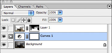
Okay, so, create a curves adjustment layer above the background but below our subject image layer (inspirationally titled “Layer 1” in my previous screenshots). It should look like this:
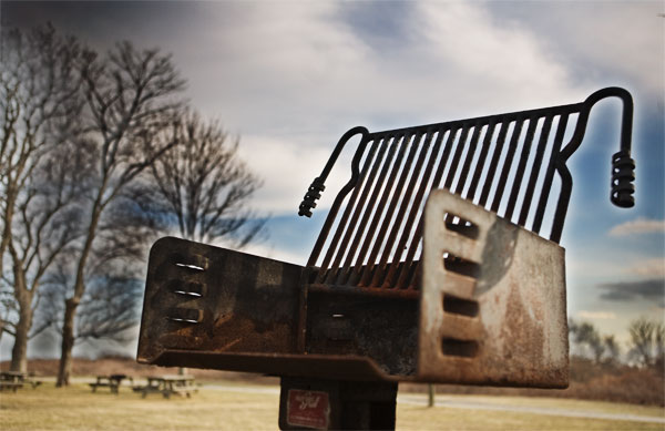
The curves dialog will open and you will want to put in a dramatic “S” curve like you might in any other photo with poor contrast. Because adjustment layers only affect the layers beneath them, it should alter the background without altering the subject. Here is what mine ended up looking like!
I hope this has been useful and/or interesting and I do intend to create more Photoshop how-to articles in the future. If you have any questions about how this works, drop me an e-mail! I might add common questions and answers to this page, so keep an eye out!
Comments