Histograms: Huh?
I don’t think there is a single digital photographer who hasn’t, at one time or another, looked at a histogram (much like the one below) and thought What the fuzz is this thing trying to tell me? If that describes you, or if you just want to know more about this ubiquitous and curious graph, you’ve come to the right place.
Today I will unclothe the common histogram and show you not only how to read it, but also how you can use it to strengthen your work.
The histogram is a very powerful tool because it provides an instant window to image information that is otherwise very difficult for a person to get a sense of. According to the Photoshop CS manual,
A histogram illustrates how pixels in an image are distributed by graphing the number of pixels at each color intensity level. This can show you whether the image contains enough detail in the shadows (shown in the left part of the histogram), midtones (shown in the middle), and highlights (shown in the right part) to make a good correction.
Most importantly for photographers, the histogram shows you this subtle highlight and shadow information in a way that is completely independent of your monitor’s capabilities and color profiling.
Great, so it shows us detail information, or something like that. What does that mean exactly? As stated in Adobe’s definition above, the left side of the histogram represents the darkest pixels in the image, while the right side represents the lightest pixels. The height of each “bar” (in a Photoshop histogram, each bar is one pixel wide) represents how many pixels of that precise brightness exist in the image relative to all the other brightnesses. All of this is much easier to understand if you can see it. So, here:
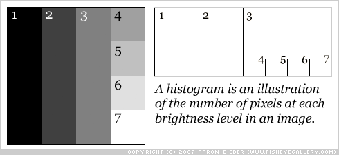
I have conveniently numbered each shaded area of the image and their corresponding histogram bars. The first thing you should notice is that the bars move toward the right of the histogram as the shade gets lighter. Because areas one, two, and three get progressively lighter by exactly the same amount, their bars in the histogram are evenly separated. Likewise for areas four through seven.
The next thing to notice is the height of the bars. How are the heights of these bars calculated? An important note when looking at any histogram in Photoshop is that the graph is scaled so there is never any “wasted” vertical space. In this case, bars one, two, and three are precisely one quarter the size of the entire image, so even though the number of pixels in each of those sections is precisely one quarter the number of pixels in the entire image, the bars are not one quarter the height of the histogram. Why? Because there is no single shade of pixel that has a higher count than any of those sections (one, two, or three). The graph is scaled vertically.
Okay, so why are the bars for sections four through seven as tall as they are? Each of those four sections of the image is one quarter the size of section one or two or three (as you can probably tell just by looking), so their bars in the histogram are one quarter the height of the bars for sections one, two, and three. Is this all making some sense?
Just by looking at this histogram (which is harder to read by virtue of its sparsity, but bear with me), we can actually see that the image must contain precisely seven distinct pixel brightnesses ranging from completely black to completely white (and look, it does!). Furthermore, we can see (for example) that there are about one quarter as many pixels of brightness four than there are of brightness three. Fantastic.
So what happens when the image has many more shades in it? Let’s say, for example, that it has every shade in it.
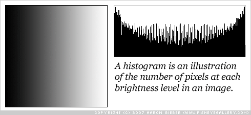
Be honest: is the histogram at all what you would’ve expected it to be? I was a bit surprised to see that curve in there, but it does show us some things about the Photoshop gradient tool that we might not have known before!
We have already drawn the first conclusion from this histogram: it contains every possible shade of pixel. We know this because the data begins at the very left edge and proceeds all the way to the very right edge without a single gap. What happens if a shade is removed?

The attentive among you will notice that two changes have occurred. First, there is a pretty obvious gap where that particular shade of gray was removed. Second, the bar at the very right edge is now filled in. Why? Because I covered the gray shade with a white line, so the count of white pixels has now increased! Brilliant.
Let’s make a more drastic change and see how that affects the histogram display:
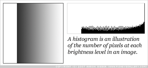
I have now removed most of the dark tones in the example image. Notice that the histogram has a huge gap on the left side. No matter how large or small your image is, the histogram always ranges from 100% black on the left to 100% white on the right. Also notice that the tallest bar is the one at the far right, for 100% white. This is because there are more completely white pixels than pixels of any other brightness in the image, so the histogram is now scaled to the height of that bar (the tallest bar).
By now you should be pretty comfortable getting the following information out of a histogram:
-
The range of tones in an image; does the image contain completely black and completely white tones, and is it missing tones anywhere in the range?
-
Which tones occur most often in the image; which bars in the histogram touch the top?
That’s a good start, but it won’t make you more proficient at editing your photographs. Let’s take a look at a real example to see how what we’ve learned applies to a photo.
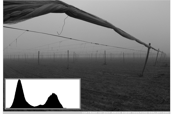
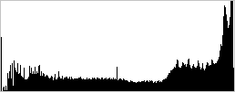
Here is a photograph that I made at one of the (many) tobacco fields up in Windsor, Connecticut. It was a foggy morning and, as you can see from the histogram, there are no very light tones in this image at all (you can tell by the large gap on the right side). Notice also that there is not a significant amount of black (the curve on the left doesn’t begin immediately at the left edge).
I want to evenly brighten this image so that the sky area becomes white. I will use levels for this (which I won’t explain; there are ample articles for using levels), but you could also use curves. Once I’ve brightened the image, it might look more like this:
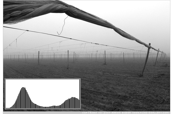
There are two important things to notice about this histogram. First, you may wonder why it’s full of gaps. These gaps are a side-effect of expanding the tonal range of an 8-bit image; Photoshop shifts and redistributes the tones in the image to give the best perceptual result, but it doesn’t (and cannot) create more pixels with intermediate tones to complete the entire tonal range. This is one of the linchpins in the 8-bit versus 16-bit editing debate, which I may cover in a later article.
Second, you will notice that I now have a significant amount of pure white in the image (the very last bar on the right goes all the way to the top of the histogram), and the curve appears to be “cut off.” This is usually a bad thing, because it tells you that you have lost highlight detail. If this were a high-key portrait, or if your intent was to wash out the sky to pure white, you would have succeeded. I didn’t mean to do that, though, so I’m going to undo that change and try again.
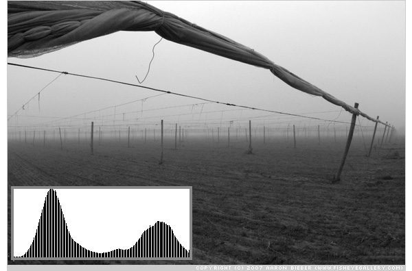
The changes in the photograph itself might be very subtle and difficult to see on your monitor. This is the entire point of the histogram. By reading the histogram, you can tell what’s going on even if you can’t see it in the photo. Notice that I have not clipped as much of the highlight area of the tone curve, leaving almost no pure white at all. This tells me that my sky is going to be filled almost entirely with delicious digital sensor noise, which will give it a more continuous tone and realistic feeling.
By keeping an eye on your histogram, you can quickly and easily evaluate whether or not you’ve achieved the result you were after. If your camera has the ability to display a histogram you can even do this evaluation in the field. I personally use the histogram display on my Canon 5D just about 100% of the time; once I have seen the composition through the viewfinder, what I’m most concerned with is the exposure, and the histogram allows me to see that no matter how bright or dark it is, and no matter how accurate the camera’s LCD display is. A truly valuable tool!
That’s it for our in-depth examination of the histogram and all of its exploits! I hope you’ve enjoyed digging into the mechanics of this very useful tool and if you have any remaining questions or if you think I screwed up anywhere along the way, please leave a comment!
Lightroom, Lightroom, Lightroom, Lightroom

While reading histograms directly on your camera is the first step toward complete control of your exposure, no digital photographer should overlook the importance of post-processing. When Adobe released Lightroom, I was already using Apple’s Aperture, but after only a few hours, I was ready to switch. I was a Lightroom pre-release beta tester and I have purchased every upgrade to Lightroom ever since; it’s literally the killer app of killer apps.
Lightroom takes the histogram to the next level with RGB graphs and over- and under-exposure views that actually show you on the photo itself where you’re losing detail. Not only is Lightroom an indispensable tool for developing photographs, it’s an awesome way to learn how imaging works.
If you haven’t purchased Lightroom yet, let me urge you now, please, please buy it. It will change the way you develop and organize your photos. On top of that, if you buy it from B&H at their great price, and use one of the links below, you help me keep this site online… Which I would really appreciate. Using these links does not change your cost in any way, shape, or form.
- Adobe Photoshop Lightroom 3 Software for Mac & Windows
- Adobe Photoshop Lightroom 3 Software for Mac & Windows - Student & Teacher Edition
If you are a student or a teacher, you can get a huge discount by purchasing the second one; it’s absolutely identical in every way (except the box, it says “Student & Teacher Edition” on it), but you do need to produce proof of your student or teacher status.
Comments