Full-Spectrum Viewing Area for Under $15
How many times have you held up one of your photographic prints in the light of day—actual, real day—and thought That’s not at all what I bargained for? Never? Well that’s good. You must be one of the lucky ones, or one of the blind ones.
Even with the best equipment that money can buy, ICC profiles, spectrophotometers, an iron-clad color management workflow, and a high-end monitor, your eyes are the ultimate judges of your work. But eyes, they don’t work alone; you can’t see anything without light, and the quality of the light will have as much an effect on what you see as the color of the print itself.
I got onto this topic after reading Michael Johnston’s overview of his Viewing Station. All these years I’ve been experimenting with lights in my studio space, let’s call it Single-Serving Photo HQ—or, as my friends call it, my bedroom—and I never once thought to write about it.
After the jump I’ll tell you how to dramatically increase your viewing conditions for about $15.
Michael says he uses one of those clip-on Verilux full-spectrum fluorescent setups. When I started down this path, I hadn’t heard of Verilux specifically, but I was sure I wanted to go fluorescent after being turned off by these so-called “daylight” incandescent bulbs that were nothing more than regular bulbs with bluish glass designed to offset the orange light they actually generate. Michael’s entire lamp, which includes the bulb, cost him around $80. We can do better than that.
Get a Bulb
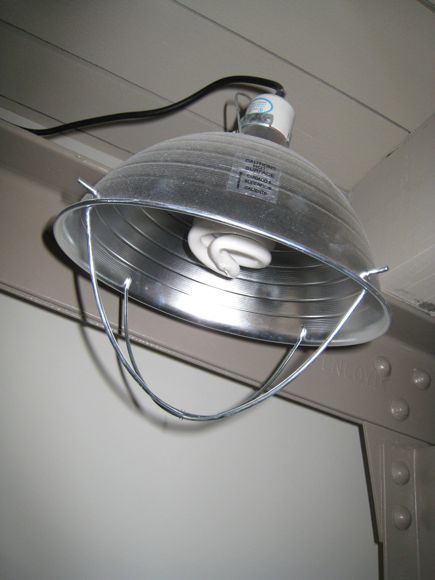
I wound up sampling several compact fluorescent bulbs from 1000bulbs.com and eventually decided upon a 100 watt equivalent 5100k model. Here’s a picture of what it looks like, sort of:
There are perhaps four important considerations when looking at bulbs for your viewing environment.
-
Wattage (or equivalent wattage, when talking about fluorescent)—I like my viewing conditions to be fairly bright, so I went with 100 watt equivalent, but you may prefer to go higher or lower.
-
Spectrum—Get a bulb that is classified as “full-spectrum,” meaning that it doesn’t purposefully exclude certain wavelengths.
-
Color temperature—Anything from 5,000K and up should do fine. I prefer 5,100K, you might go as high as 5,400K.
-
Color Rendering Index (CRI)—This method of measuring the color accuracy of a light source has its flaws, but it’s better than guessing; a higher number is better, 100 is perfect.
A Note About CRI
The Color Rendering Index (CRI) is a measure of a light source’s ability to reproduce color. Those of you mathematically inclined or simply curious can read about it on Wikipedia. This particular system has its detractors, but it’s the system most widely used at the moment, and 1000bulbs.com lists the CRI value for most of its bulbs, especially the ones billed as “full-spectrum.”
The Verilux bulbs that you find in systems such as Michael’s rate around 86 and up on the CRI scale. The bulb I chose scores an 82, which by all accounts should be good enough for any normal person. Some halogen bulbs are rated 100, which is as accurate as a light source can be on that scale, but halogen is expensive, hot, and may be too bright for some people.
23 Watt, full-spectrum, 5100K CFL from 1000bulbs.com: $5.71
Get a Lamp
What good is a bulb without a lamp to screw it into? Perhaps you have a spare lamp somewhere in your house that you can use, but if you don’t, do not despair. I went down to the home improvement store and picked up a simple work light (sometimes also called a painter’s light or a clip light). Here is a pretty basic one offered at Lowe’s; I don’t remember where I got mine.
Simple clip-on work light: $7.48
Clip it onto something, such as your apartment’s fashionably painted structural beams, and away you go!
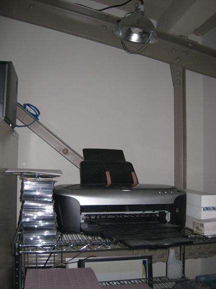
I actually bought three bulbs, three work lights, and plugged them all into a single power strip so I can turn them on and off with one switch and light my whole computer area. It’s very helpful to be able to lay prints out on top of the printer or on my desk and have the same quality of light everywhere.
You will definitely see a difference in the appearance of your prints as you move them from one light source to another. Nearly every print will have some variation in the way it reacts to light. Some inkjet inks are known to be rather more prone to this change in appearance (which is called metamerism), such as Epson K2 (the inks I use). It’s not necessarily a bad thing, but as an artist you need to be aware of the possible ways in which your work will be viewed and whether you are satisfied with the work’s performance.
So there you go. A full-spectrum viewing solution for less than $15.
Comments