Ever Wondered About Gamma?

Have you ever wondered about that “gamma” thing you keep seeing? You nerd.
Really, though, gamma is important and you have probably seen the word all over the place in photography and design. It’s actually a really cool thing and when you understand how it works you will likely feel better about yourself, your photographs, and about the universe. Well, you’ll feel smarter, anyway, and you will be. You’ll also be able to add another item to your lists of:
-
Answers to questions nobody will ever ask you,
-
Greek letters you recognize, and
-
Awkward things to bring up on a first date
You can already check off number two if you look up on the right there. Yup, that’s gamma.
Additionally, if you are friends with other photographers and they don’t know what gamma is or how it works, you might come out of this looking like a rockstar. At least to the extent that rockstars are knowledgeable about non-linear power-law expressions.
So what is gamma? Aside from being the third letter in the Greek alphabet and a type of brain wave, the word “gamma” is used in imaging (photography, design, broadcast technology) to refer to “gamma correction,” which relates to adjusting the luminosity of an image as it is displayed on (usually) a screen of some kind.
You have probably heard or seen things like “gamma 1.8” or “gamma 2.2” thrown around, especially in the photography world, and that’s where the math starts to creep in. But before I get all numeric on you, let’s take a look at what gamma correction really means, how it’s used, and why it’s important to you.
Gamma Correction, What Does It Mean?!
The truth is that gamma correction is pointless. Gamma correction is one of those things that was invented to solve a problem (and just in time, too), and then its use spread throughout the world and was written into standards that were carried through generations of technology until we reached the point where it wasn’t necessary… But it was already too late. So even though gamma is a vestige of a problem we more or less no longer have, we can’t stop using it or we’ll create even more problems.
Gamma correction is a way of adjusting the luminosity of an image in a non-linear way, which means that the change in luminance for a particular value in a source image depends upon that value. Uh oh…
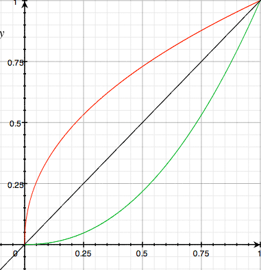
Here comes a graph, look out!
Now, the first question you should be asking is Why would you want to change the luminance values in an image? and the answer is quite simple. CRT technology.
Remember CRTs? Cathode ray tubes? Those big, heavy, glass picture tubes used in every single television set and computer monitor from around 1922 when they were first commercialized until about 2007 when LCDs first overtook CRTs in overall sales?

They had a pretty good run, I’d say. Well, cathode ray tubes have what they call a “triode characteristic,” which basically means that the relationship between the input voltage (incoming image luminance) and the luminance on the screen itself is not linear. In fact, at low voltages, the luminance is far too low, and as the voltage increases the luminance does not quite increase in step.
This is demonstrated by the green line in the graph above. The “input voltage,” or “source luminance,” is on the x axis, across the bottom, and the luminance seen on the screen, or “output luminance,” is on the y axis, up the left side.
You can see that the output luminance is severely depressed, and you would be, too, if you were trapped inside a cathode ray tube. Anyway, to make a long story only slightly shorter, this is a big problem. This is a problem because you can’t just brighten the entire image or all of your very light areas basically get overexposed and wash out. What you need to do is “reverse” the effect of the triode characteristic… Which is exactly what gamma correction does.
The red line is the mathematical inverse of the green line. If you process your input image according to the red line and display it on a CRT, the image’s luminance will even out to the black line, which is what you want. A perfectly linear relationship between the image data you send in and what you see on the screen. Brilliant.
The Math
Let’s just talk about math for about one minute more. Remember equations? Right. An equation is what mathematically describes your output luminance based on a particular value of your input luminance. For gamma, it’s pretty simple:
Output = Input gamma
The output luminance is equal to the input luminance raised to the power of the gamma value. In actual textbook mathematics of course they would use the actual Greek symbol “gamma” up there, but this is a photography blog. To get the opposite curve, you just replace “gamma” with its reciprocal, “one over gamma.” So, for the curves up above, this is the equation I actually used:
Output = Input 2.2
The infamous 2.2 gamma! Indeed. So when folks talk about a “gamma of 2.2” or a “gamma of 1.8,” what they are talking about is how much luminance correction is being done. You’re learning so much already! And I’m not even done yet!
What Gamma Setting Should You Use?

Once upon a time, when early Macs were the first home computers to have color screens and the ability to view and print color images, Apple engineers encountered this triode characteristic. Expectations were a lot lower then when it came to computer graphics, but when someone opened a picture on their snazzy Mac and then printed it on their equally snazzy color LaserWriter, they expected it to come out looking more or less the same as it did on the screen. But this was hard to pull off when the screen was lying to them about the luminance values.
Back then, Apple was not concerned with how accurate the color was in a universal sense–in the ICC color profiling sense that would come much later. They just wanted the images to look the same when printed on the color LaserWriter. So, they did some experiments and they found that a gamma correction of 1.8 would get it right in line with what came out of the printer.
A bit later on, another group of bright folks got together with a different purpose. They called themselves the National Television System Committee, or NTSC for short. The FCC created the NTSC in 1940 to standardize black and white broadcast television. By 1950 they were getting together to standardize color television. Ultimately they developed what is still referred to as the NTSC standard (or NTSC color television standard, sometimes), and saved the world of television. Alright, not really, but they certainly knew all there was to know about TV and they were intimately aware of the gamma problem.
Their solution was to use a gamma correction of 2.2 to make TV images look correct on your home screen in your darkened living room. When Microsoft Windows came out and started pushing more color computers into the home, they adopted the NTSC’s 2.2 gamma recommendation.
With the differing gamma values of 1.8 and 2.2 being used by Macintosh and Windows-based computers, an image that looked correct on one would often look too bright or too dark on the other. This is the way it was all the way up until last year when OS X 10.6 “Snow Leopard” was released and for the first time ever set the default gamma on a Macintosh computer to 2.2.
So What?
You just read 1,300 words about gamma correction, viewed a pretty graph, and learned a bit of history. So far, you have a handful of Trivial Pursuit ammunition and a radical ice-breaker for your next blind date, but none of this really helps you in your quest to be the world’s most awesome photographer (although reading my blog is always a good first step!)
The most common question asked about gamma is, “What gamma setting should I use?” Since OS X now defaults to 2.2 and Windows has used 2.2 for decades, the answer is 2.2. You will probably not gain anything by using a different value unless the lighting conditions where you’re sitting are totally extreme. Like the beach in July. Or a cave deep beneath a granite mountain (which is where my evil lair is located).
Thanks to color correction systems, ICC profiles, and soft proofing, you really don’t have to worry about gamma too much. Images in Photoshop (and Firefox 3.5 as well) will be adjusted based on their embedded profiles (assuming they have profiles).
The Most Important Thing
The one thing you need to remember is this: when you are exporting photos for use on the web, always, always, convert them to the sRGB colorspace and tag them with the sRGB profile. The profile itself contains a gamma setting (typically, guess what, 2.2) and folks on the web using Firefox will see the image properly adjusted while folks with browsers that don’t support color management will see the closest to what you would expect. sRGB is very reliable when it comes to this.
If you have any questions about gamma, if I didn’t explain something very well, or if you want to lavish me with praise, please leave a comment. I do read them. I really do.
Comments