Art Concepts in Photography, Part 1: Texture
There are two other parts to this series, Part 2: Composition, and Part 3: Positive/Negative Space.
Having spent most of my developing years surrounded by it, I have always taken for granted many of the fundamental guidelines of art. Perhaps due to the complexity of its technical aspects, formal photography courses tend to focus (no pun intended) on the equipment and techniques of creating images and not as much on their content.
Learning the traditional “rules” of art (or what I would call the rules of design) is important for two specific reasons. First and foremost, to make your work better. Following the rules–as well as judiciously breaking them–will strengthen your compositions, but you need to know what they are before you can do either. Second, to enhance your critiquing ability. By learning the basic terminology of art you will be able to take full advantage of critique from your peers as well as articulate your own.
So let’s get started! Today I’ll be discussing texture.
So what exactly is texture?
texture adj. (pl. textures)
- The feel or shape of a surface or substance; the smoothness, roughness, softness, etc. of something
In painting, texture is sometimes used to add dimension to a piece beyond its mere color and shape. The technique of building up thick layers of paint to form raised peaks and waves is called impasto and has been in use for centuries. Masters such as Rembrandt as well as notable modern artists such as DeKooning were big fans of impasto. Light reflects off of the contoured surfaces of raised paint, sometimes casting small shadows, allowing the painter to create additional levels of realism in fabrics or to add the impression of motion.
In photography, texture can play a significant aesthetic role. With help from its best friend contrast (which I’ll cover in detail later), texture adds important tactile cues that can give the viewer an immediate experience of what they’re looking at.
Behold, Figure 1.
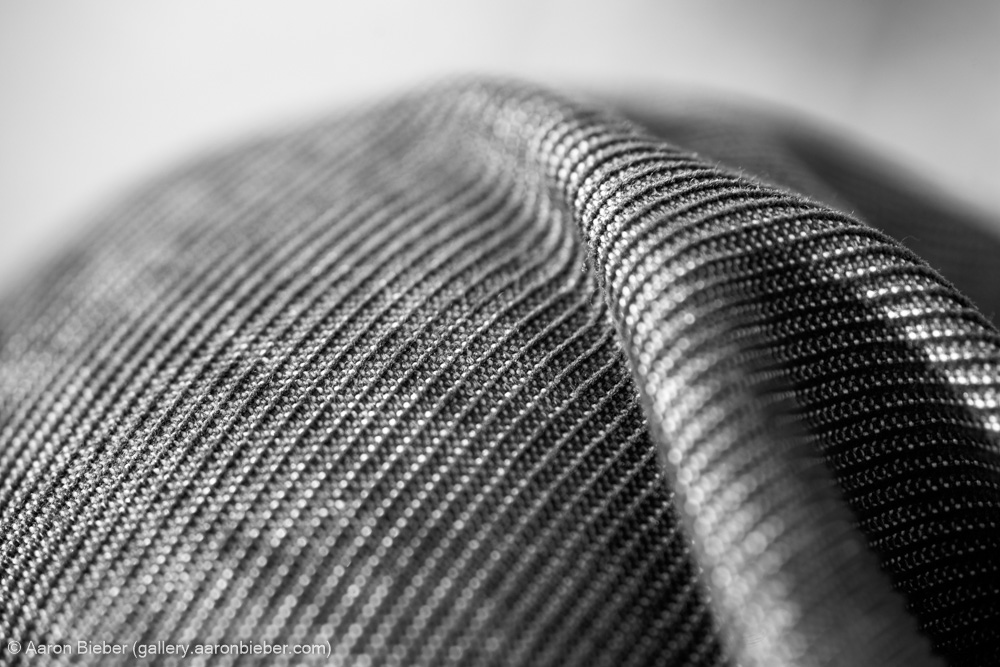
I made this photograph at the park in March while I was sitting around watching people fly their kites and throw their Frisbees. It’s actually my knee, clad in corduroy, but shot with my Sigma 105mm f/2.8 macro lens. When I look at this image, I feel as though I could almost touch the surface of the material. I have a very real sense of what it would be like to touch it, and that’s the key to using texture.
I chose this photograph as an example not because it is a singular work of art, or even among my favorites, but because it exemplifies the use of texture as the subject; there is very little else in this image that is interesting. In post-processing (using Lightroom), I chose the “strong contrast” tonal curve preset, which deepens the shadows and boosts the highlights. Contrast and texture are intimately related because the cues that give us the impression of textures in an image are all formed through contrast. Keep that in mind.
Now, Figure 2.
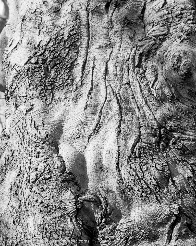
Tree bark is a ubiquitous source of texture in photography–and for good reason. In this image, the light through the branches of the tree strongly reveals the bark’s texture because of its downward angle. Once again, using the tone curve adjustments in Lightroom allowed me to enhance the textural effect. I also used Lightroom’s built-in sharpening (which many in the field have criticized, but I like just fine thank you) to further punch up the roughness.
This is a good case of a subject that, from a distance and shot in a traditional way, would probably have yielded an image of limited interest. Especially considering the bright midday sun and stark shadows, it would be hard to achieve anything too pleasing. Keeping texture in mind, however, introduces new possibilities for using the situation to best advantage. Having a mental library of compositional techniques may allow you to make very nice photographs in locations or at times that are inappropriate for your preferred style.
Finally, Figure 3.
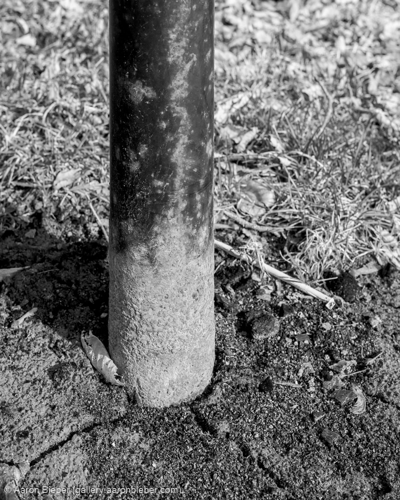
In the above piece, texture is only one player on a team of compositional tools including contrast, line, form, and depth; design elements that I will be discussing in more detail in future installments of this series. Once again focusing my post-processing efforts on the tone curve and sharpening tools, I have enhanced the prominence of the ground’s texture as well as the surface of the pole.
Speaking in purely photographic terms, capturing textures is tied most strongly to aperture. The above photograph was exposed at f/8, which was sufficient to keep the pole and nearby ground (where the texture was most interesting to me) in focus while still allowing the background to fall away into soft bokeh. Because texture does best at smaller apertures, textural images are best achieved under brighter conditions, which allows some of the best textural photographs to be made during the bright, raking light of the midday sun–a time of day scorned by landscape photographers the world over.
The aperture in SLR cameras always remains fully open to its widest setting so that the view through the eyepiece is as bright as possible. When you press the shutter button, your selected aperture setting is applied before the film or sensor is exposed, but you can’t see any of that because by then the shutter has been closed and the mirror flipped up. In order to get a better idea of what your textural subject will look like at different aperture settings, you should use the “aperture preview” button if you have one. This button, when held, will stop the aperture down to your selected setting. I use this button constantly.
You may have taken note of the fact that my three example photographs are in black and white. There is no reason that texture cannot be a prominent feature of a color photograph, but in my mind a photograph only deserves to be presented in color when the color itself is a prominent player. Also, black and white images have a more flexible tonal range because the underlying colors can be adjusted independently before the conversion to black and white. Lightroom handles this magnificently with its “Grayscale Mix” palette. With a broader tonal range to work with, your textures can be adjusted intricately.
Hopefully this article has given you a better understanding of the part texture can play in your images and how to enhance it by paying attention to contrast and tonality. In upcoming articles I will dive yet deeper into design concepts, so stay tuned, and feel free to bury me in questions and comments!
Continue to Part 2: Composition, or straight to Part 3: Positive/Negative Space.
Comments