Art Concepts in Photography, Part 2: Composition
This article is part of a series; you may want to start at the beginning: Part 1: Texture, or continue to Part 3: Positive/Negative Space.
Because this is only the second part in my Art Concepts series, I want to study the more general and fundamental stuff first. In the last episode, we looked at texture. Texture is a fairly specific element, so today I thought I would take a big step back and talk about composition.
When we say “composition,” we refer not only to the relative locations of the points of interest in a piece (which is the most discussed aspect), but also to their sizes, shapes, colors, and other variables that contribute to the balance (or imbalance) of the work. That’s what we’re going to look at today.
The Rule of Thirds
Photographers who are starting out and who begin exploring the generally available advice for creating interesting images will swiftly come across the rule of thirds. Most everyone who has spent any amount of time reading about photography, or art in general, is sure to have heard about the rule of thirds.
The rule of thirds says that the points of interest in a composition are most effectively placed at the intersections of a grid made up of two horizontal and two vertical lines, each equidistant from one another and from the edges of the piece.
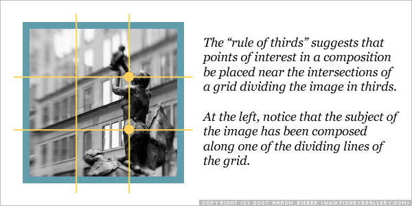
More simply stated, the points of interest in the image ought to be roughly one third the total height or width of the image from any of its edges. This rule was created to help beginners shake the desire to place their subject smack in the center of the frame, which, generally speaking, is a boring thing to do.
As with all things in art, this rule can be broken. With experience, an artist will find situations where a centered subject is very pleasing to the eye, but not until he or she is aware of this rule can it be thoughtfully applied or violated.
Coincidentally, this was also mentioned recently on the Digital Photography School blog in a post entitled Break the Rule of Thirds You may want to go read that to get an idea of why the rule of thirds can and should be broken on occasion.
More Advanced Principles
The rule of thirds is a simplistic rule, and a useful one for teaching composition fundamentals, but what I want to talk about are lesser-known principles of design that will help you bring even greater control and understanding to your compositions. These principles are:
-
Balance (or weight)
-
Scale
-
Isolation
-
Convergence
These principles are independent, though also related. You can think of them as a visual design toolbox with each tool having a specific use but each specific use being a necessary contributor to the final project. In this case, scale, isolation, and convergence are helpful in managing the emphasis in a piece, which is another principle of design. Of course, your goal as an artist is to communicate an idea or transmit an emotional response of some kind to your audience. Art that fails to do this is of limited value; even stock and documentary photography make use of these design concepts to communicate their messages effectively.
Balance
Compositional balance means maintaining a consistent “visual gravity” across the expanse of a piece so that the eye is not drawn to one side more than the other (for example). More often than not, exciting compositions are intentionally imbalanced, and you may already be creating compositions like that without knowing what fundamental principles you’re invoking.
By means of demonstration, I will use some simple graphics to illustrate the concept of balance. The reason I’m not using photographs to illustrate these design concepts is because I want to be sure your understanding of them is as “pure” as possible, and simple graphics allow me to single out these concepts. In this first example, the image is very clearly imbalanced.
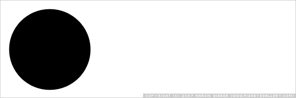
Because the large, black dot is the only thing in the image, you are forced to look at it. Your eye does not want to hang around in that empty white space because it just isn’t interested in it. The feeling of having your eye drawn more toward one thing than another is what we mean by weight. Balance is achieved by placing elements of the same weight in roughly symmetrical areas of the composition. Let’s balance this composition out in the simplest way:
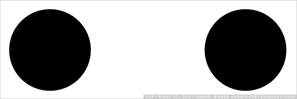
By placing an identical dot on the opposite side, we have achieved balance. Yes, it’s rather boring overall, but your eye happily moves back and forth between the two dots, exploring the expanse of the image without undue distraction. Try to get a feeling for what your eye gravitates toward. Try squinting, too (I’m serious).
It can help to squint or tilt your head when evaluating more complex images to get a feeling for the dynamics at play. Let’s make things more interesting by adding a different visual element to try to balance the first dot.
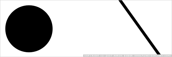
Here, the dot is countered by a line. If you are already used to looking at compositions and evaluating balance, or if you are very relaxed, you will notice immediately that the dot is still pulling all the weight of this image. Even though a visual element was placed on the opposite side of the piece, the dot still has more weight because it’s larger and because it extends toward the edges of the frame, asserting its dominance in a way.
To balance this composition, we’ll have to add more.
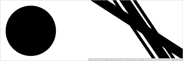
In this final example, you can see how much more visual weight the array of lines carries. Your eye is drawn back and forth naturally and balance is restored. The complexity of the lines overlapping one another makes them more interesting to look at than the dot, which increases their weight. There are several variables that contribute to visual weight in a composition and I want to talk about three specific ones right now: scale, isolation, and convergence.
Scale
Scale was really the star of the balance discussion above. As I said, there are many ways of changing the balance of a piece. Scale is the simplest to understand and control. Scale refers to the size of visual elements in relation to one another and to the composition as a whole.
In a photograph, scale is modified through perspective–by moving closer to or farther from an object. Keeping scale in mind when you compose your frame is just another way to manipulate the balance and therefore the visceral effect your image will have on its audience.
Isolation
When elements stand out from their surroundings, it’s called isolation. We can manipulate isolation in a composition in a couple of ways. First, we can alter the surroundings of an object, and second, we can change the relative scales of the object and its surroundings. Both will have an effect on how isolated an element in the composition will appear to be.
The first example is exploring contrast between visual elements and their surroundings.

Notice how the first element is easily recognizable, though the second element stands out much more strongly from its surroundings. We would say that the second element is more isolated than the first, which makes it a stronger focal point in the composition.
The second example shown below explores the effect of scale.
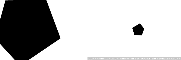
You will notice that both elements in this example draw your eye. The first is quite large and occupies a significant area of the frame, which gives it weight. The second is much smaller, yet your eye is drawn to it because of the space around it (the space around it is called negative space, which I’ll be talking about in much more depth later); because of its isolation.
Our minds process visual information spatially (though some people process what they see more spatially than others; we call those people “right-brained” because the right hemisphere of the brain is responsible for spatial recognition). When we view an image, we are subconsciously comparing its parts to what we know of the world, trying to recognize objects and relationships between them. When presented with a shape surrounded by a field of color, our mind creates a three-dimensional understanding of the space, visualizing the shape as sitting on a field of color. If two shapes are presented adjacent to one another and they are of different sizes, our subconscious reaction is that the larger shape is closer to us. Isolation works because our minds are so adept at interpreting shapes and the space around them.
You could say that photography, and even art itself, is based on shapes and the space around them.
Convergence
Convergence could be called the most obvious way to affect the emphasis of a composition. Essentially, convergence describes elements that come together at a point, though they don’t have to touch in order to be convergent. Taking advantage of the eye’s fondness for following lines, convergence can cause the viewer to trace a certain path through a composition.
Convergence can be executed very subtly in a photograph, but for the sake of illustration I will use it boldly here.
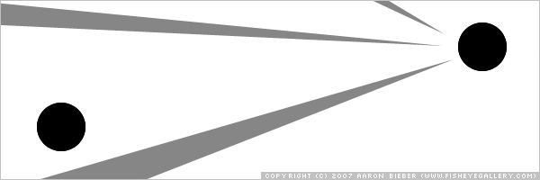
Notice how your eye catches one of those lines at the left side and “rides” it right up to the dot on the right. It’s very natural to follow lines within a composition and learning to recognize when and how that happens will help you to strengthen yours. The dots are the same size, but the one on the right draws more weight and attention because of the lines leading into it.
The Final Project
We’ve really talked about a lot here today and I commend you if you’ve actually read all the way through! After working on this post for nearly three weeks, I finally had to come to terms with the fact that I could never make it as complete as I’d like. I will try to include the parts I skimmed over or left out in future additions to this series. Suffice it to say, art is a very big subject to try to cover in a simple blog post.
Rather than post a bunch of photos here and try to describe what’s happening in them compositionally, I challenge you, my readers, to do so as you browse through photos in the next few days. I imagine most of you look at photographs daily, either yours or others’, and I would be ecstatic to hear about how you’ve applied these concepts to the creation of your own images or the critique of others'.
If you’re looking for stuff to critique, you may as well critique mine.
Continue to Part 3: Positive/Negative Space.
Comments