Art Concepts in Photography, Part 3: Positive/Negative Space
If you haven’t, you may want to read the first two parts of the Art Concepts series, Part 1: Texture and Part 2: Composition
In this, the third bite of our feast of art knowledge, I will talk about an elusive concept called positive and negative space. Traditionally, negative space is defined as the “empty” areas within an image. As you will soon see, even that which is empty can be very tangible.
Let’s start with the most classic demonstration of positive and negative space at work:
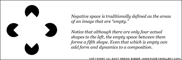
Immediately upon viewing this example, you come to realize that your mind has the capacity to create compositional elements from completely empty space. As an artist, you must understand this capability so that you can use it to your advantage. Now let’s try something a little bit different.

We generally see black as a “foreground” color and white as a “background” color, so your first impression of this picture might be that it’s a black jagged thing on a white background. Now take another look, but this time try to see it as a white jagged thing on a black background. With some concentration, you should be able to swap the fields back and forth as you look at it.
Just because a certain space within a composition is “the background” doesn’t mean it is devoid of form.
Now take a look at this funny looking person:

The figure on the left and the black field on the right are our positive space. The white area that surrounds the figure is the negative space, the “void” in the image. In a photograph, negative space is what you might casually perceive as the “juicy filling;” it surrounds your subject(s), it provides them with a place to be, but it is not itself a subject.
The moral here is simply this: do not neglect negative space because it isn’t the subject or focal point of your image. We can easily manipulate the viewpoint to make the negative space play a more dynamic role.

Here I have moved in closer so that the figure’s head touches the top of the frame, splitting the one large area of negative space into two smaller ones. This configuration gives the eye a lot more to play with. I don’t mean to say that this version is universally better than the first one, but it should demonstrate the power that negative space can wield over even a very simple composition.
Always keep negative space in mind when composing your frame; its shape is equally as important as that of your subject and your awareness of it will be immediately visible in your work.
Comments